
When it comes to office meetings, presentation boards can either be wonderfully beneficial assets or a complete waste of everyone’s time. Yes, we live in a day and age where computer presentations are pretty much the be all and end all for most, but the convenience of standard paper presentation boards is such that chances are they’ll never be wiped out entirely.

Which of course begs the obvious question – how can such boards be used with any degree of effectiveness on a consistent basis?
In truth, there is indeed something of a fine art when it comes to getting it right with paper presentation media of any kind, which once cracked is a seriously useful skill for life. While it may seem on the surface as if it’s a simple case of a blank sheet that’s just asking to be filled with anything and everything, your way you go about things will have a marked impact on the level to which the information is both understood and assimilated.
Here’s a look at a few quick tips for really getting the most out of meetings when opting for classic paper boards:
Less Crowding, More Sheets
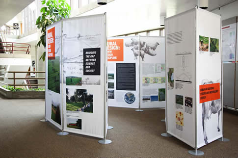
First of all, there’s nothing that sends a wave of groans throughout any meeting room quite like one piece of paper being flipped only to reveal another with 25,000 lines of text covering every square inch. By contrast however, when an abundance of text is spread between a series of pages, it doesn’t come across nearly as overwhelming. So when there’s a lot to say, the golden rule is to say it across as many pages as necessary so as to never make any one page look too crowded.
Be Careful with Colours
As a general rule of thumb – the more colours you use, the more complicated the text as a whole will appear. The reason being that colours should be used to highlight for example content of importance or specific themes and so on and so forth. Which in turn means that if you were to use a dozen colours, those in attendance at the meeting soon lose sight of what matters most and what’s relevant to what. In addition, too many colours can look unprofessional.
Use Size Wisely
The exact same rule applies to text size as well, which likewise should be handled with care. Larger text should be reserved for more important points while a standard size can be used for everything else. In addition, avoid any small text that may be difficult to read or perhaps misread entirely – and this means taking into account those at the back of the room too.
Mixed Media
One way or the other, it’s a good idea to make efforts to mix up the media content of the presentation at least a little. The reason here being that there’s little on Earth that can lose the attention of the reader in a pretty short period of time quite like page after page of unbroken text. From infographics to charts to diagrams to pictures of any kind, it doesn’t need to be dominated by mixed media but should at the same time feature at least some variety.
Standard Scan
Never forget that for employees living and working in the West, it’s pretty much drilled in from day one that we read left to right, top to bottom. As such, you have to expect that this is how each and every page of your presentation will be read by those in attendance at the meeting and thus tailor your sheets accordingly. If things end up too chaotic, chances are the main points will be misinterpreted or missed entirely.
Personal Copies
If you plan to chair a meeting where the presentation board has already been filled out or printed and will simply be gone through during the meeting, nothing is of more benefit than handing out individual copies of the paper presentation to everyone in attendance. This can either be done at the beginning or when the meeting comes to an end, but is a brilliant way of ensuring full attention throughout as it eliminates the need for scribbling notes at high speed.
Quality Equipment
Last but not least, you can’t rightly expect your presentation to be taken seriously if you use pens that don’t work properly, paper that tears the moment you touch it or a board that’s prone to collapsing entirely when it’s so much as looked at in the wrong manner. If you’re trying to convey a message of professionalism, professional equipment matters.